To improve the personalization and usability of Baskin Robbins' online platform, focusing on seamless navigation and customer satisfaction.
Context
their online platform faced challenges in user navigation, mobile responsiveness, and transaction ease, which impacted customer satisfaction and sales. The goal was to create an intuitive, enjoyable online experience that mirrors the delight of visiting a Baskin Robbins store.
Details
Time Frame:
2 week
Role:
UX Researcher
Tools:
Figma, Miro, UserTesting.com
Responsibilities:
Gap Analysis, Heuristic Evaluation, Usability Testing, Website Audit, Information Architecture, High Fidelity Mockups

Overview
identifying usability gaps and implementing solutions to enhance customer satisfaction and engagement. Challenge
Business Goal
The goal of Baskin Robbins is to spread happiness by celebrating everyday moments with delicious ice cream treats, cakes, and desserts, offering over 1400 flavors for every occasion.
Observed Issue - 01
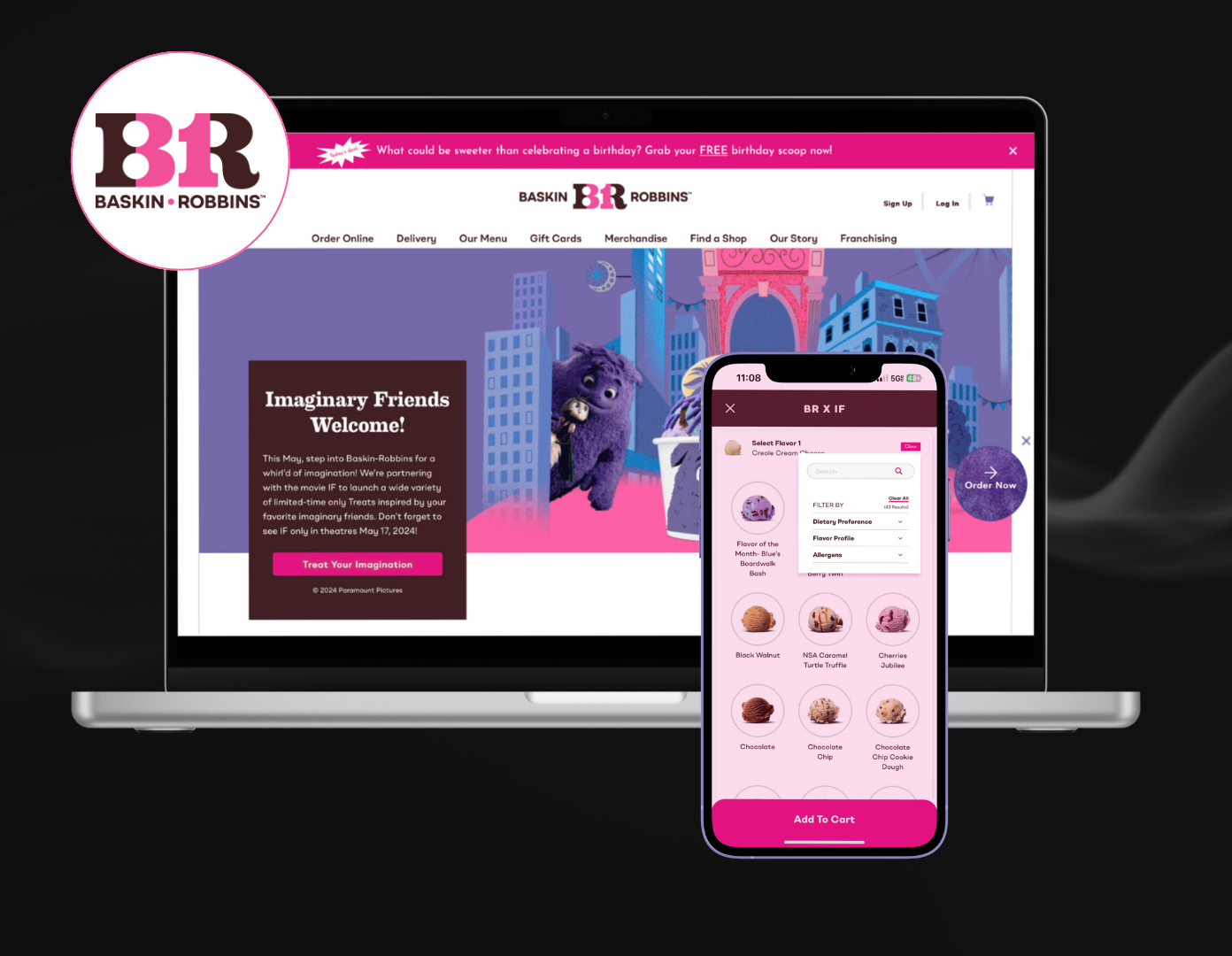
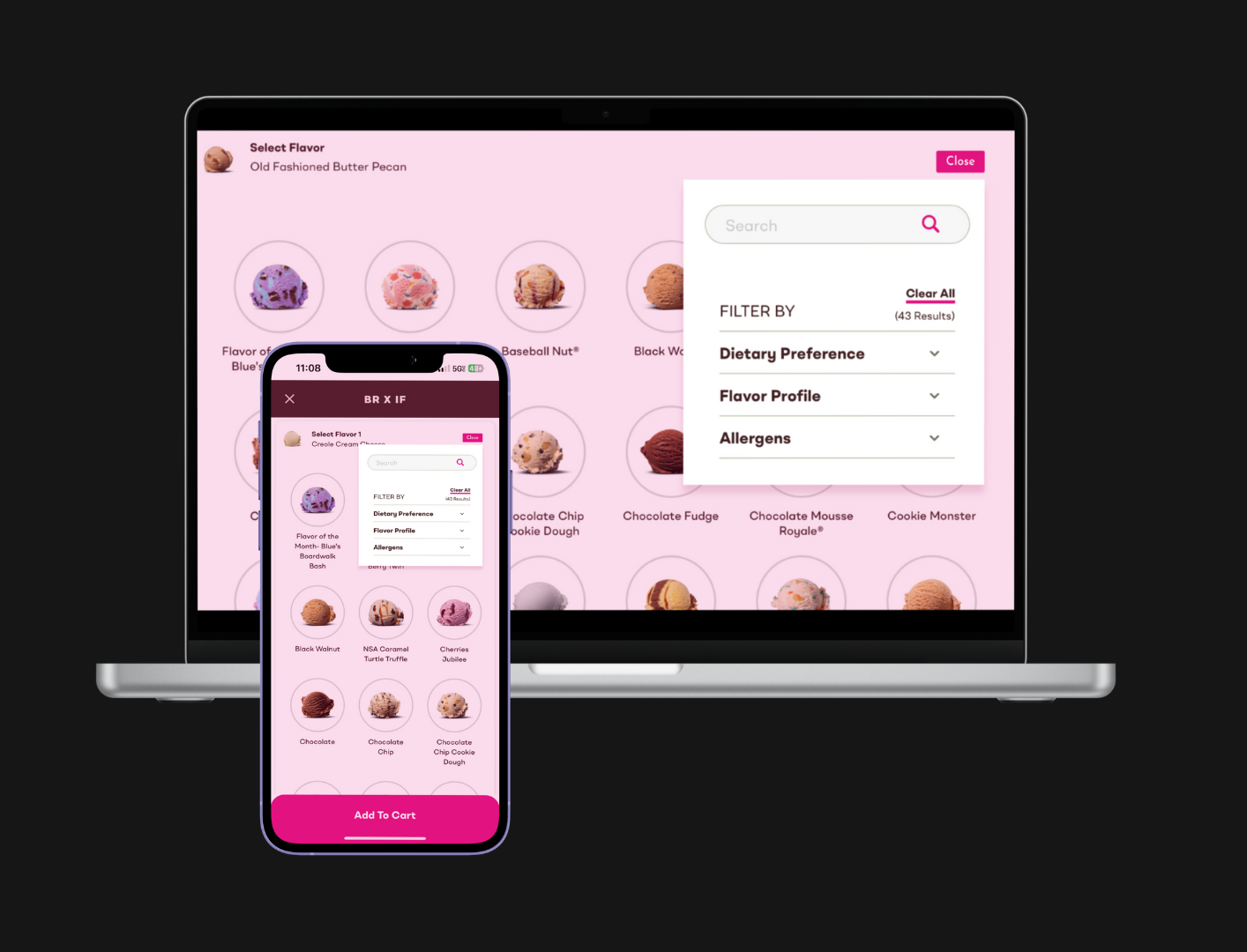
During usability tests, it became evident that customers found it challenging to efficiently combine multiple ice cream flavors in one order. This issue often arose from an interface that wasn’t designed to easily accommodate such customization, especially when mixing classic and limited-time flavors.
Suggested Approach
It’s crucial that customers don’t face a complex process when searching for an item on the website. Implementing a search and filter option allows customers to easily narrow down their search, accelerating the ordering process and increasing business profitability.
Creating a seamless procedure for customers results in a positive user experience.
Observed Issue - 02
During evaluations, it became clear that while the mobile version effectively highlights deals in the menu bar, the website places these offers in the footer, making them less visible and harder to read. This inconsistency affects users’ ability to easily access and take advantage of discounts, particularly when browsing on desktop platforms.
Suggested Approach
To enhance user experience, it’s recommended to display deals and offers directly on the main page rather than having just a navigation link to a separate page.
Making deals and offers upfront and visible encourages customers to explore and purchase more products, resulting in increased sales and customer satisfaction.
Observed Issue - 03
User testing revealed that the absence of a clear return policy on the website made customers hesitant to purchase size-dependent merchandise like T-shirts. This hesitation often led them to opt for alternative products that did not require size specification, impacting sales of merchandise that could otherwise enhance brand engagement.
Suggested Approach
Implementing a clear return policy is essential to build trust and confidence among customers, encouraging them to make purchases without hesitation, especially for size-dependent items.
integrate this feature to ensure consistency across all digital platforms, enhancing the user experience and maintaining uniform access for all customers. Designer's Insight
As a designer, I recognize that enjoying ice cream is not just about taste, it’s an emotional experience of joy. Reflecting this in our UX design means creating an inviting and seamless digital journey that enhances the user’s happiness, mirroring the delight of Baskin Robbins’ flavors. This empathetic approach deepens user engagement and supports the brand’s mission to spread happiness.
Reflection and learnings
Simplifying Complexity
Enhancing Baskin Robbins' digital presence taught me to distill complex processes into user-friendly experiences, aligning closely with users' expectations and needs.
Proactive Feedback
Regular feedback from mentors and user testing sessions was crucial. It guided design refinements and ensured decisions were data-driven and user-centric.
Ensuring Consistency
Maintaining design consistency across platforms proved essential for user trust and seamless experience, emphasizing the brand’s reliability.
Designing with Empathy
I learned the importance of creating emotionally resonant experiences, where every design element contributes to the joy associated with the brand.