JournAize is designed as an AI journaling app that facilitates both offline and online journaling. It provides in-depth analysis of entries to help users track their progress and receive personalized life improvement suggestions.
Details
Time Frame:
3-4 Days
Role:
UX Researcher
Tools:
Figma, User Testing, Dovetail, Visily.ai, Google Forms
Responsibilities:
UX Research, Usability Evaluation, Information Architecture, User Persona Development, Wireframing, Prototyping, User Testing, Feedback Analysis, Interaction Design, Visual Design
The primary goal is to empower users to lead more fulfilling lives through the insights offered by AI, while also encouraging a habit of consistent journaling.
Process
This UX design process was chosen to ensure a comprehensive understanding of user needs and market dynamics, which guided each phase of development. Starting with Discover to gather initial insights, moving through Define and Ideate to align design choices with user expectations, and culminating in Design and Testing to refine and validate the product.
This structured approach ensured the app was user-centric, intuitive, and effectively met its goals.
Challenge
The primary challenge identified was addressing user’s inconsistent journaling habits. The app needed to not only encourage regular use but also make the process engaging enough to convert sporadic journaling into a consistent routine.
This involved understanding user behaviors and motivations through research, and then designing features that would meet these needs while keeping users engaged over time.
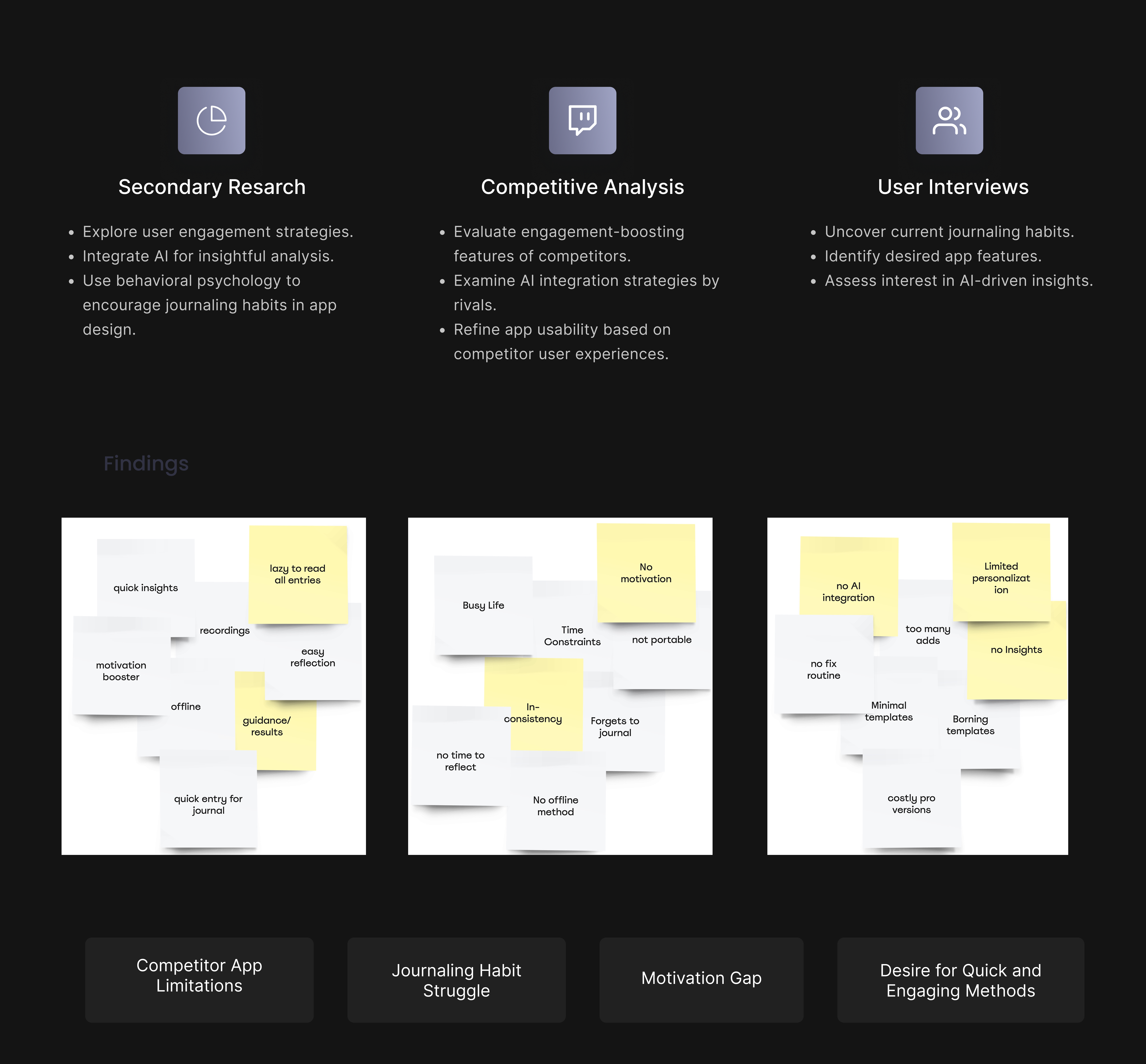
The initial phase focuses on understanding the environment in which the app will operate. This includes Secondary Research to grasp broader trends in AI and journaling apps, Competitive Analysis to identify what competitors are doing well or lacking, and User Interviews to directly gather insights about user needs and expectations.
Focus point
I explored user’s journaling habits and motivations through user interviews, gaining insights into their initial intentions for journaling and the challenges in maintaining it as a regular habit.
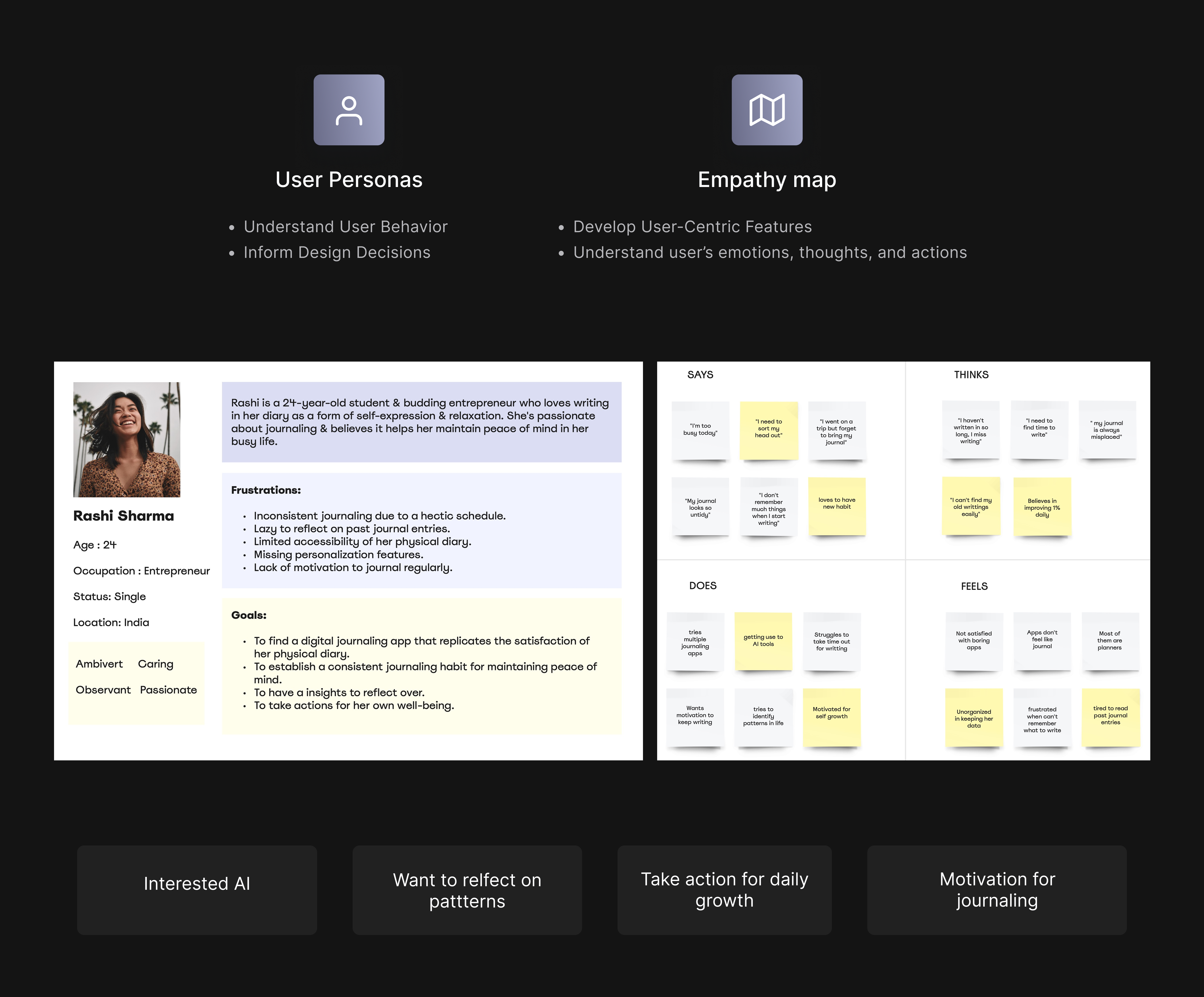
Define Phase
I synthesized the insights gathered from the Discover phase to define clear user personas and empathy maps. This helped tailor the app’s design to directly address the specific needs, behaviors, and emotional drivers of potential users, ensuring the features and user interface would effectively support and enhance their journaling experience.
Core Finding
A significant finding was the deeper emotional connection users sought from journaling, which hadn’t been fully captured in the initial Discover phase. Many users viewed journaling not just as a habit but as a therapeutic tool for personal growth and reflection.
Ideate Phase
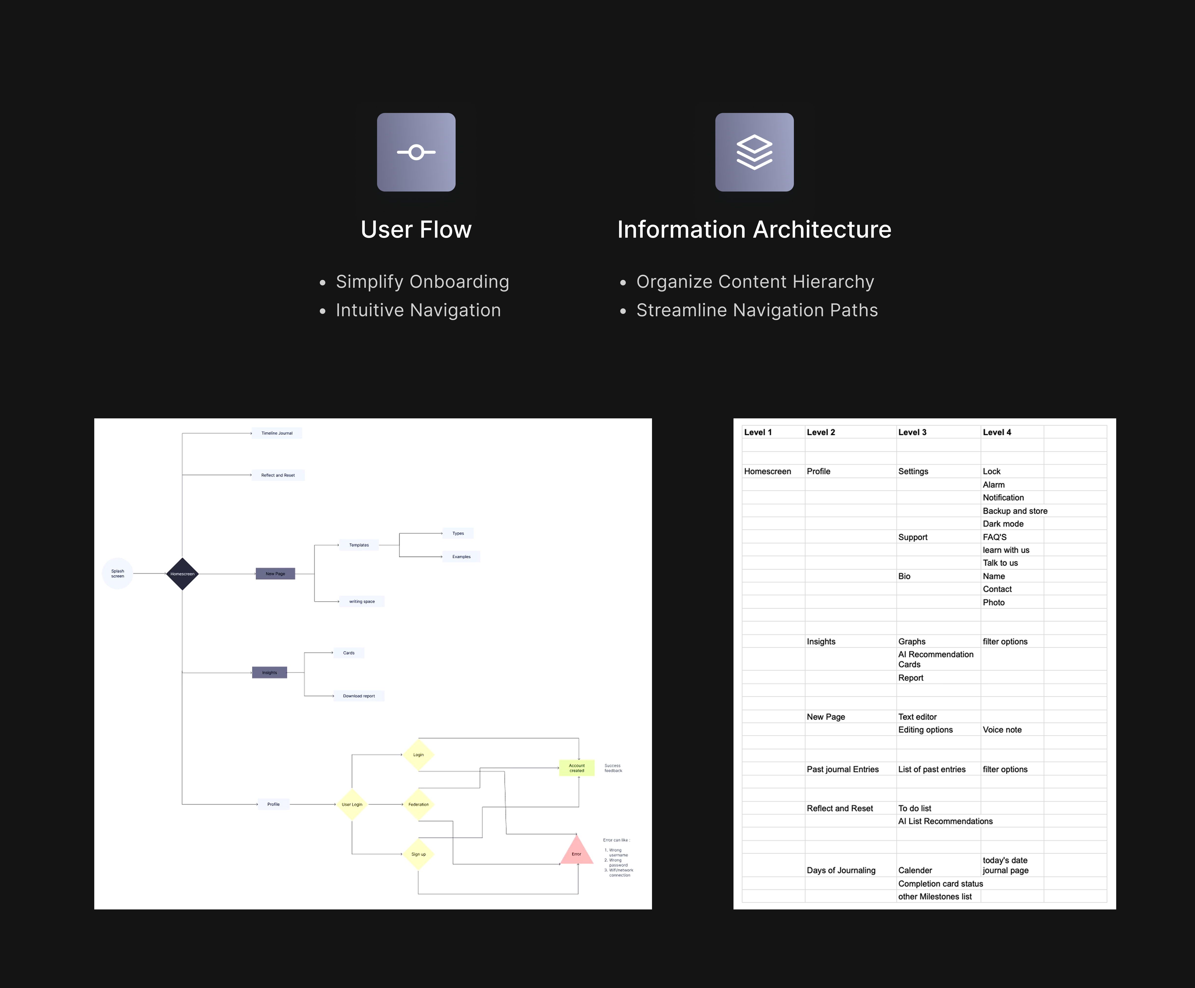
I streamlined the app’s information architecture and sitemap to keep things minimalistic and user-friendly. My goal was to make navigation intuitive, allowing users to easily engage with the app’s features for a smoother journaling experience.
Suggested Approach
I focused on the UX principle of "Simplicity and Clarity," aiming to streamline the user experience to ensure intuitive and easy navigation.
Design Phase
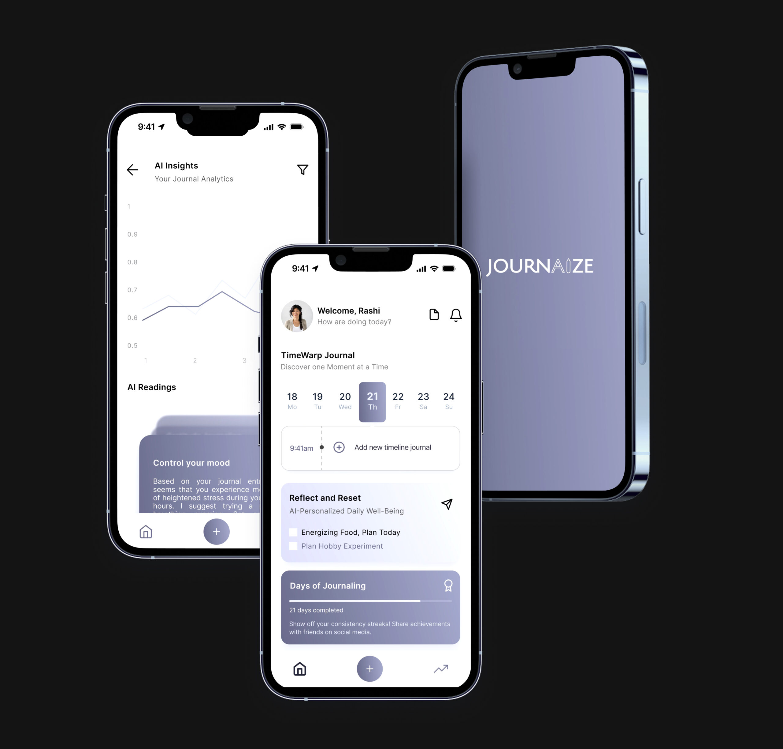
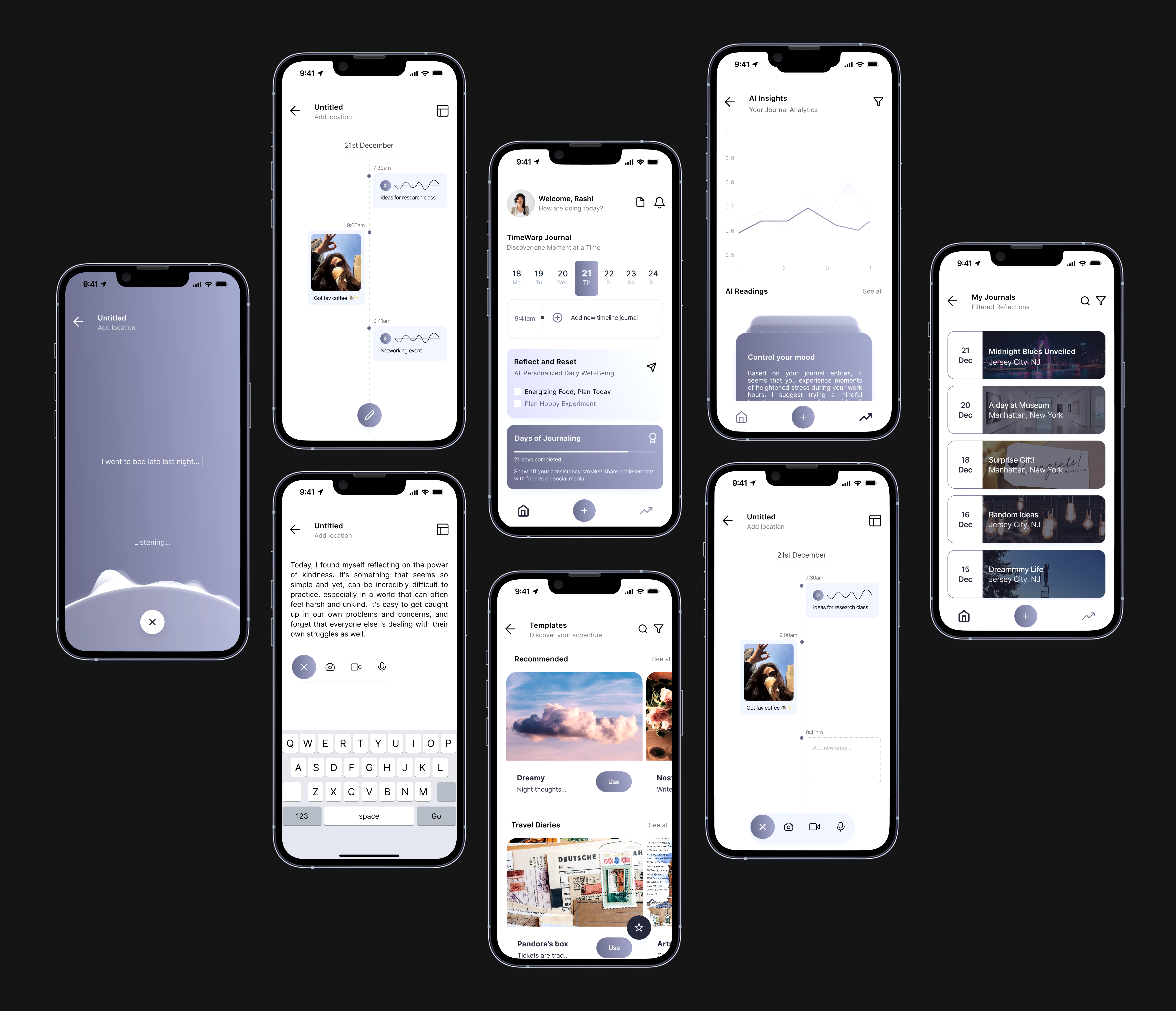
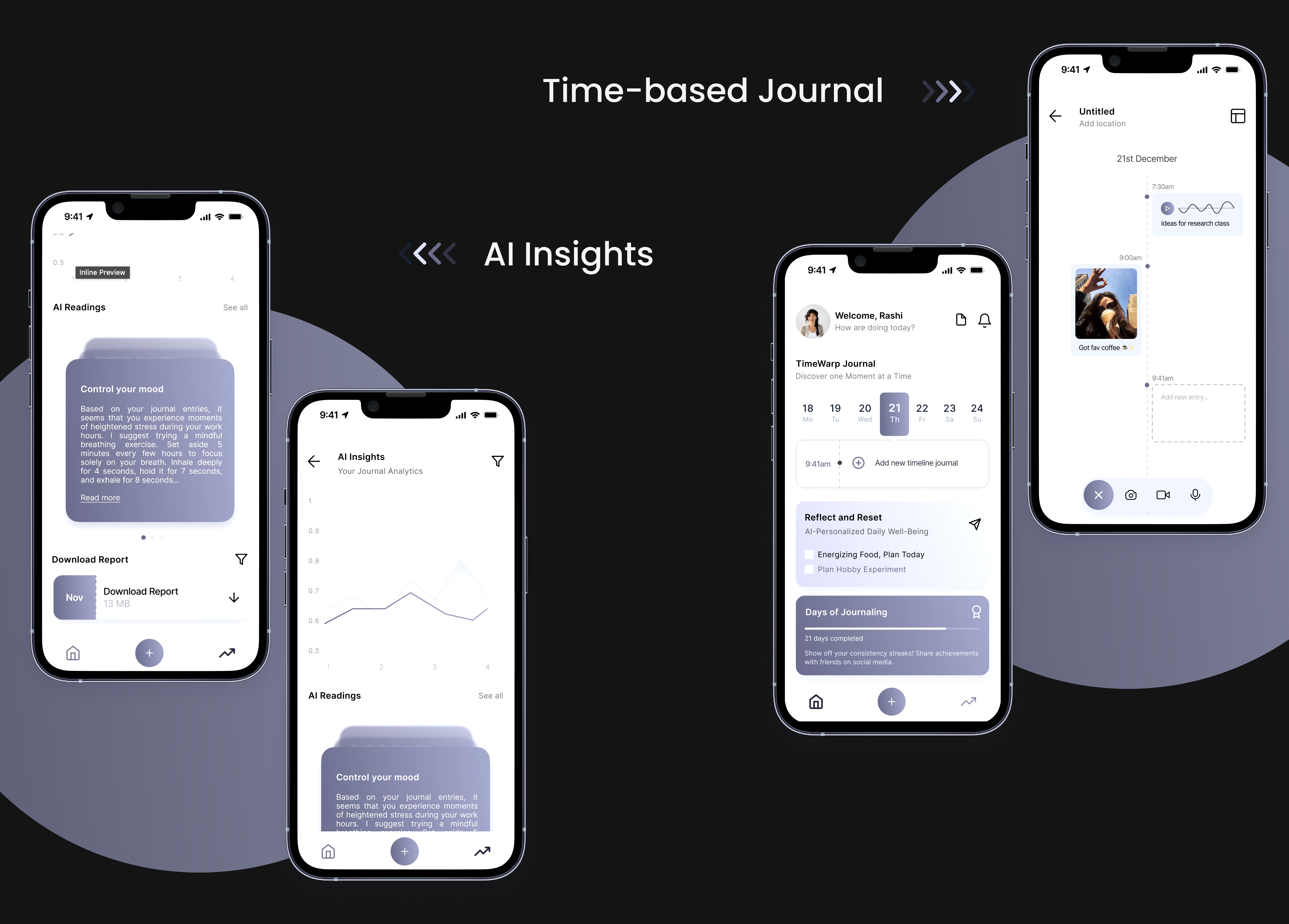
I focused on creating the Time-based Journal feature to help users who struggle with journaling regularly. This feature breaks the journaling process into short, manageable intervals, making it more approachable for those who find regular journaling daunting.
Another key feature was AI Insights, used to analyze journal entries and offer personalized feedback. This functionality helps users recognize patterns and track their progress, thereby enhancing the journaling experience by making self-reflection more meaningful and tailored to individual needs.
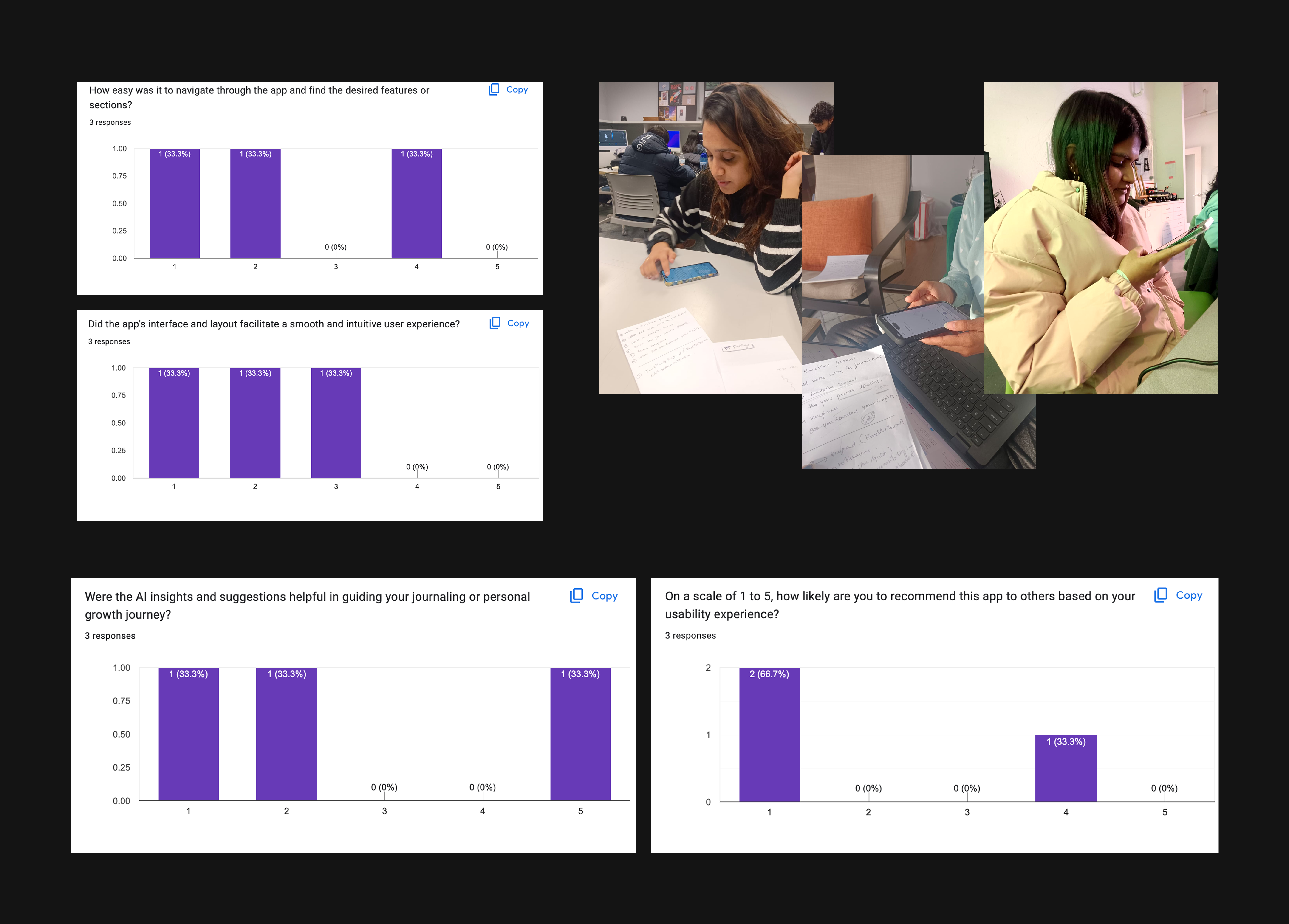
Testing Phase
I focused on task-based usability testing and user interviews to refine the app’s interface and functionality. This approach helped me gather direct feedback on how users interact with the app and identify any areas needing improvement, ensuring the final product was both intuitive and effective in meeting user needs.
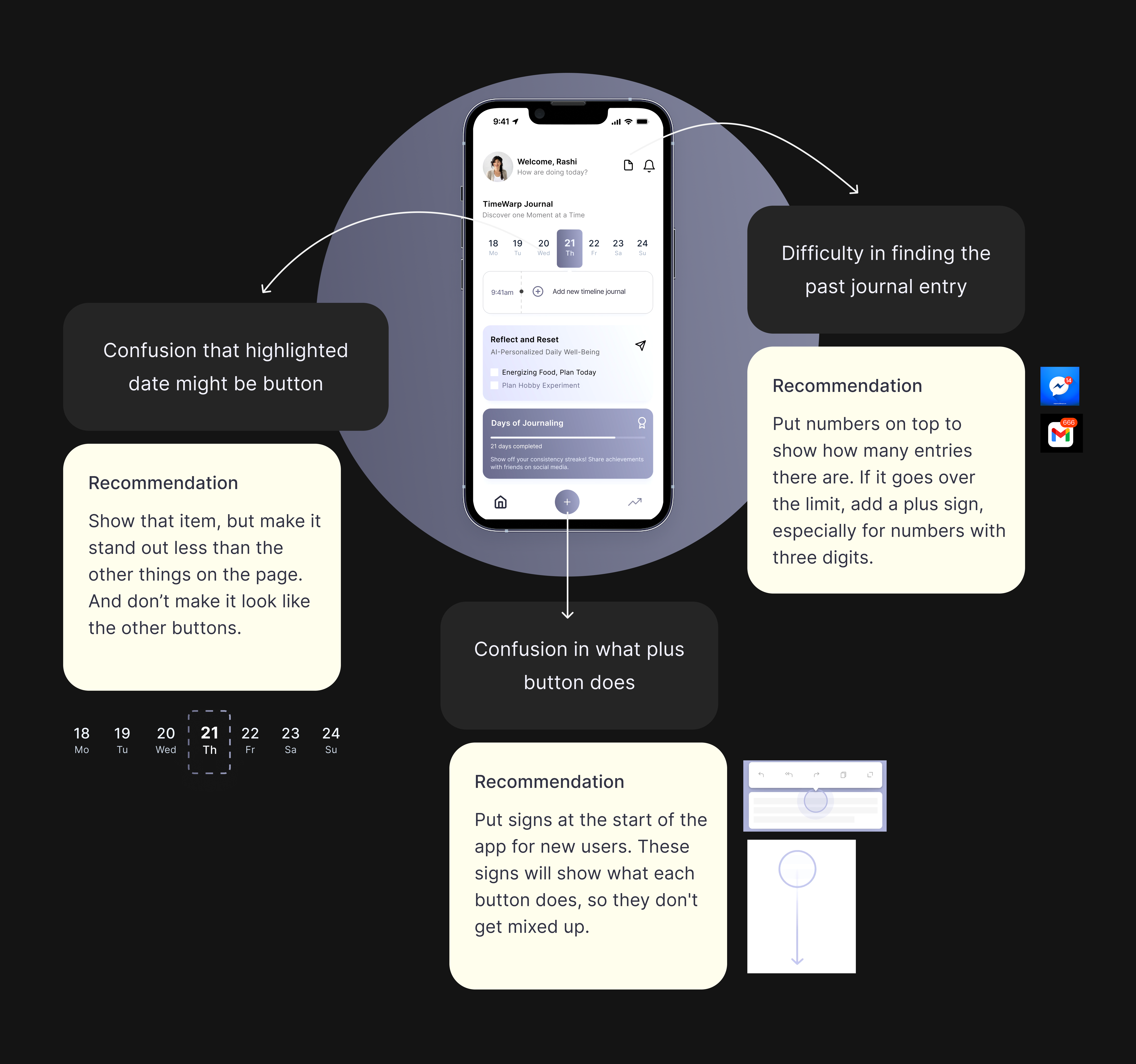
Concise findings from the usability testing
Users mistakenly thought that highlighted dates were actionable buttons.
Users found it challenging to navigate to past journal entries.
There was uncertainty among users about what the plus button is intended to do.
Reflection and learnings
User-Centric Approach
Learnt the importance of centered the design on user needs and preferences, ensuring a user-friendly experience.
Holistic Experience
Crafted a holistic journal experience with seamless user flow, information architecture, and AI insights.
Enhancements after testing
Improved usability by testing and refining the app based on user feedback.